7 Tips to Look Good and Get Results - Don’t Underestimate Aesthetics
Eldon Kao

Everything that I have encountered about Lean Six Sigma is academic and theory based. What I find that is often missing are the small details that get into how to execute some of the tasks in a workplace setting. A big part of initiating and sustaining a Lean program is how information is visually presented to the group. Like any other form of media or corporate communication, this material needs to be engaging to your target audience and promote participation. Here are 7 tips for making a great visual presentation:
Know Your Audience
This is always Rule #1 when writing a communication, remind yourself of who you are writing for. The information relevant to you may not be to this group. If you are the Subject Matter Expert, the jargon you use may not be ideal for this group. Make sure your message is clear and on topic.Font
Never disregard font choice as if it were a trivial matter. You wouldn’t want to represent yourself on a resume using Comic Sans and the same should apply for corporate communications. Also be aware of how much area you have to cover and from what distance you want viewers to be able to see your material. Too often I see visual boards that are word heavy and really distract from getting the message across.Color
Remember that use color is not just for decoration, it is for visual aid. Color can be used to draw the eye to areas of interest, but too much color just adds noise to your senses. Also be weary of incompatible color combinations that do not help with visibility. Try to use color strategically.Graphs
All numerical data is tabulated by default but that doesn’t mean that it is the best way to present it. Rows and rows of numbers in a spreadsheet is not visually engaging. Find the best way to visualize this data either through pie charts, bar graphs, or color coding. This makes trends easier to spot. Is the process improving or not?Recognition
Take broad communications as an opportunity to recognize the achievement of a fellow co-worker. It is important to celebrate successes and share them with the team. Also, this adds an engagement element to a board that is metrics focused.Actions/Conclusion Statement
Be sure to include a take home message or list action items for continuous improvement. I’ve often seen metrics being shared with staff with no suggestion or actions on how to improve on them.Less is More (K.I.S.S. principle)
Refrain from feeling the need to fill all the empty space on a board. Too much information is intimidating to read. Information that is hidden among too many pictures and graphics becomes lost and ineffective. The key is to make sure all the information you want to convey is simply stated and could be read from a distance.
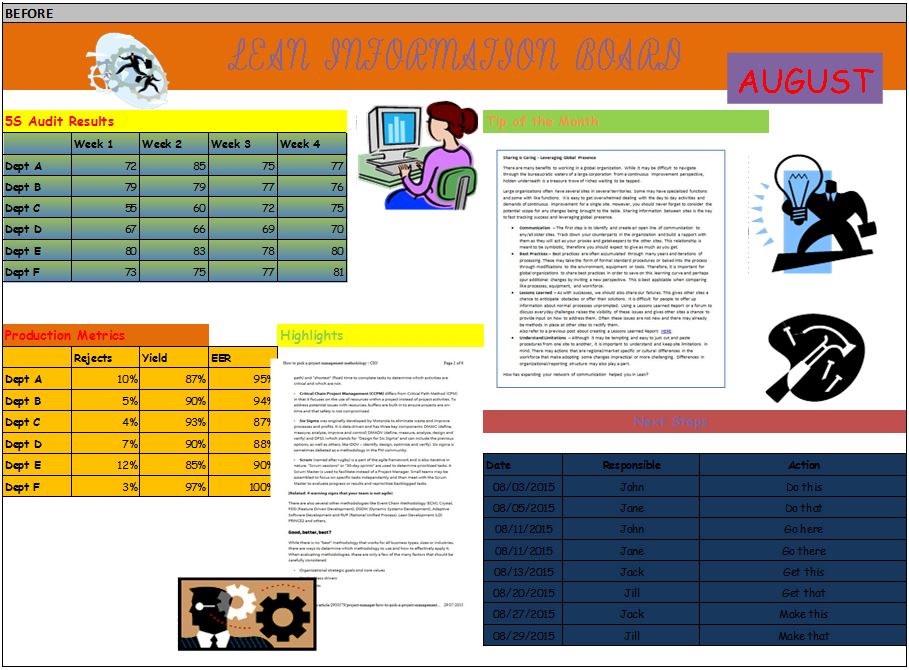
I have included below an example of a Before and After visual board using the tips mentioned above: Mouse over the image to see the After picture.
Discussion
Don’t underestimate aesthetics when preparing presentation materials, it is the easiest way to grab the attention of your target audience and will keep them engaged. Do you have any other tips on how to create effective visual boards?